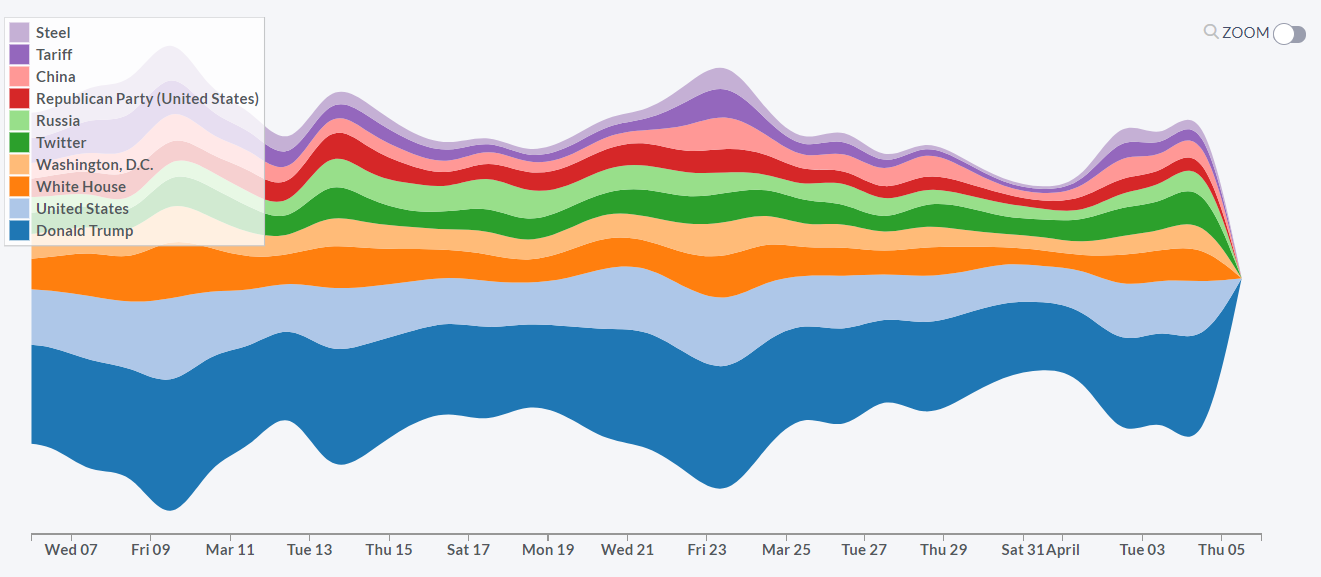
Content to display articles: concept trends
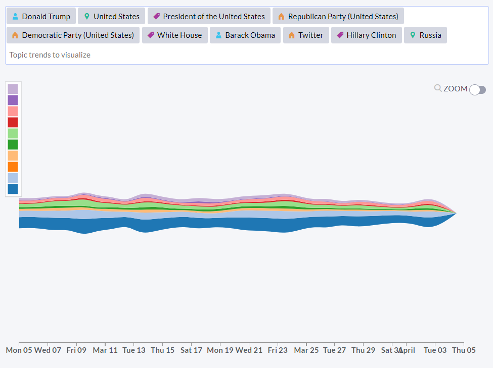
The visualization shows the trending of the selected concepts in the articles. The graph shows how frequently each of the concepts was mentioned in the news articles on a daily basis. Each color represents a different concept in the graph.
You can choose which types of concepts you would like to be visualized (by unchecking windows for “Person”, “Location”, “Organization” and “Nonentities”).
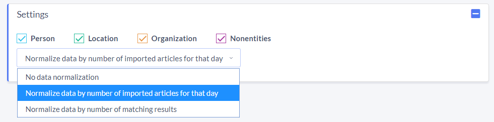
Since the number of published articles differs by days (usually there is about 30% less content published over the weekends), it is important that we can normalize the graph in order to eliminate these patterns.
The data is by default normalized by the number of imported articles for that day, which removes the impact of the weekends. If you want, you can also skip normalization (option “No data normalization”) or normalize the graph by the number of matching results (option “Normalize data by number of matching results”). In this case the graph is simply stretched to the minimum and maximum values of the graph for each day.
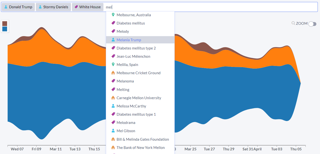
Instead of using the preselected list of concepts that are most relevant for your search, you can manually enter your own concepts of interest.