
Content to display events: concept trends
Concept trends show how the frequency of mentions of individual concepts in the events changes over time. The visualization should be especially useful when viewing events over a longer time period when themes can change significantly. Each color represents a different concept in the graph.
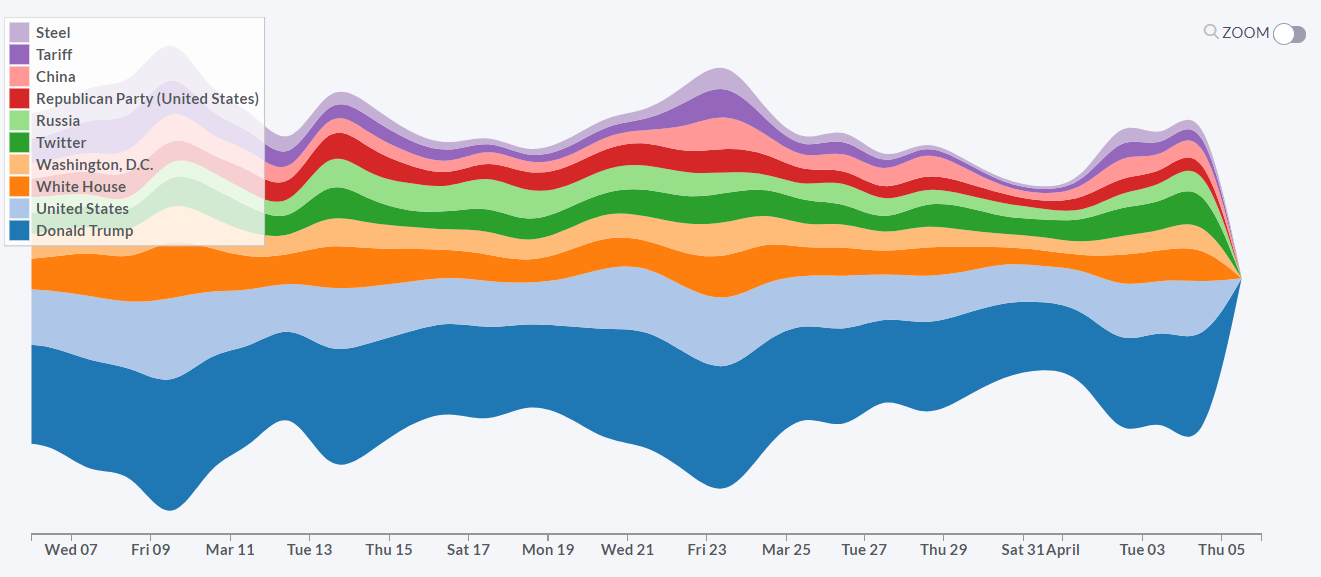
You can choose which types of concepts you would like to be visualized (by unchecking windows for “Person”, “Location”, “Organization” and “Nonentities”).
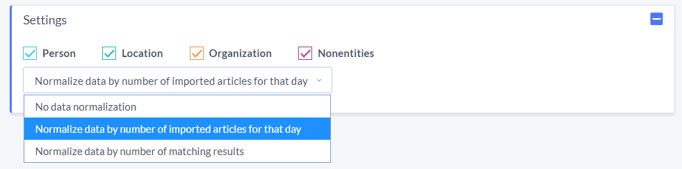
Since the number of published events differs by day (usually there is about 30% less content published over the weekends), it is important that we can normalize the graph in order to eliminate these patterns.
The data is by default normalized by the number of imported events for that day, which removes the impact of the weekends. If you want, you can also skip normalization (option “No data normalization”) or normalize the graph by the number of matching results (option “Normalize data by a number of matching results”). In this case, the graph is simply stretched to the minimum and maximum values of the graph for each day.
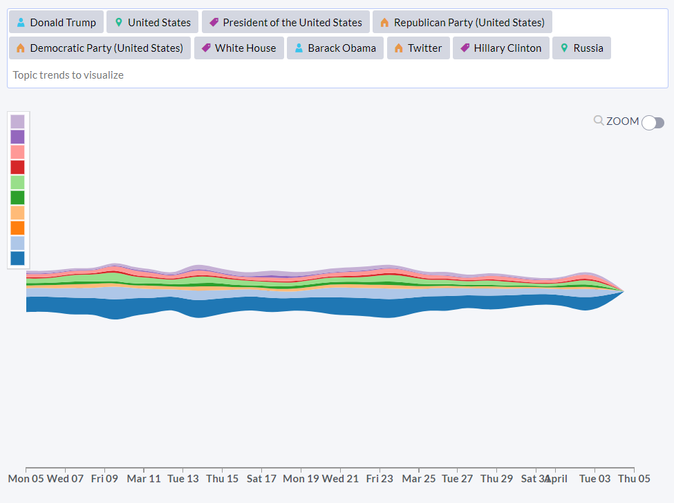
Instead of using the preselected list of concepts that are most relevant for your search, you can manually enter your own concepts of interest.
